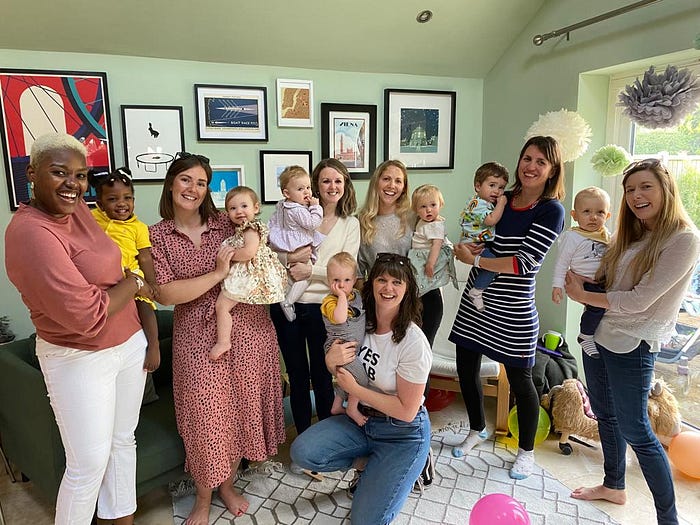
A support network, not a service
So for the past couple of weeks I’ve become clearer about my cause — to make sustainability easy for parents with babies. But how do I communicate that? Should I change my logo, my tagline, my font?
People love brands like Patagonia because they feel like they care, they stand for something. And you can’t fake that. You can’t just tell people that, you have to show them. In discussions with my cohort at Impact Central over the past couple of weeks, we’ve discussed the idea of Borro being more about creating a community of sharing, rather than just a service. Rental is really digitising hand me downs — a support network that has always existed — and making it easier and more accessible. This is more relevant now than ever. With people moving around the country for work, and a lack of local community, new mums and dads can feel isolated from family and friends who would have supported them. Whether that’s in terms of childcare or passing baby clothes along families in the same street. Borro should be more than a cold business service — it should be helping to replace our lost support network. A network which we need more than ever before, given that parents are often juggling both career and childcare.
So perhaps I’ll forget about the colour of the logo or the font on my website for now, and instead focus on building that support network. That’s what I want my brand to be.